Itstory: Fight The Stigma
What is the queer movement? Where it started? Who started it?
Itstory is an interactive landing page that seeks to provide information and raise awareness on the Queer movement in an educational, cultural and inclusive way.
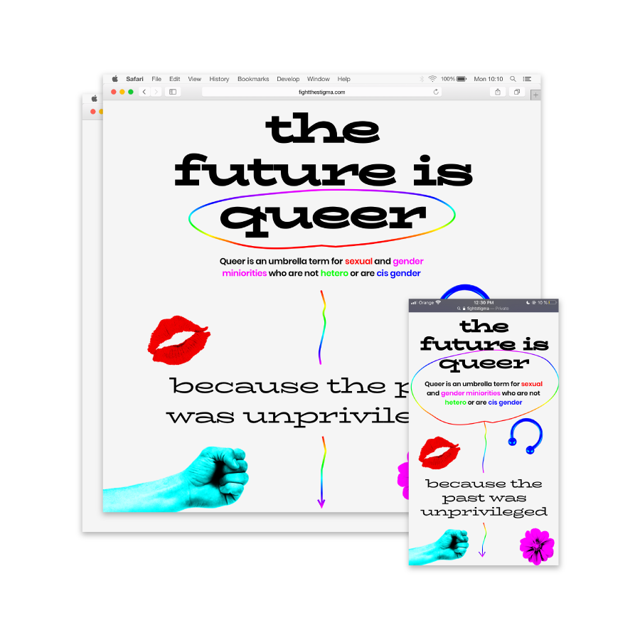
What is the queer movement? Where it started? Who started it?
Itstory is an interactive landing page that seeks to provide information and raise awareness on the Queer movement in an educational, cultural and inclusive way.

The Queer movement was born in the 1920s and 1930s. It is known for its defence of freedom in terms of nonnormative sexual and gender identities.
The start of such an open and inclusive movement implied a clash with those more narrow-minded people in the 20th century. At that point, lots of activists related to the movement fought and defended these ideas.
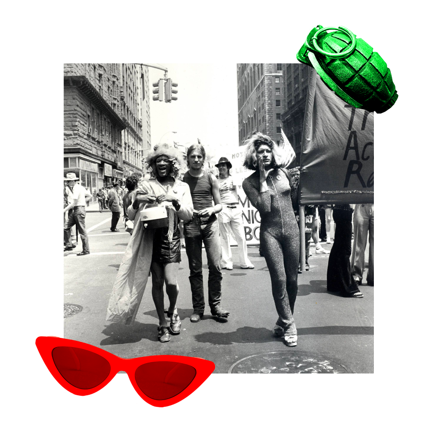
Most of the people in the movement were related to underground minorities with almost no privileges as opposed to the rest of the society. However, they were able to start this movement that is still influencing nowadays.
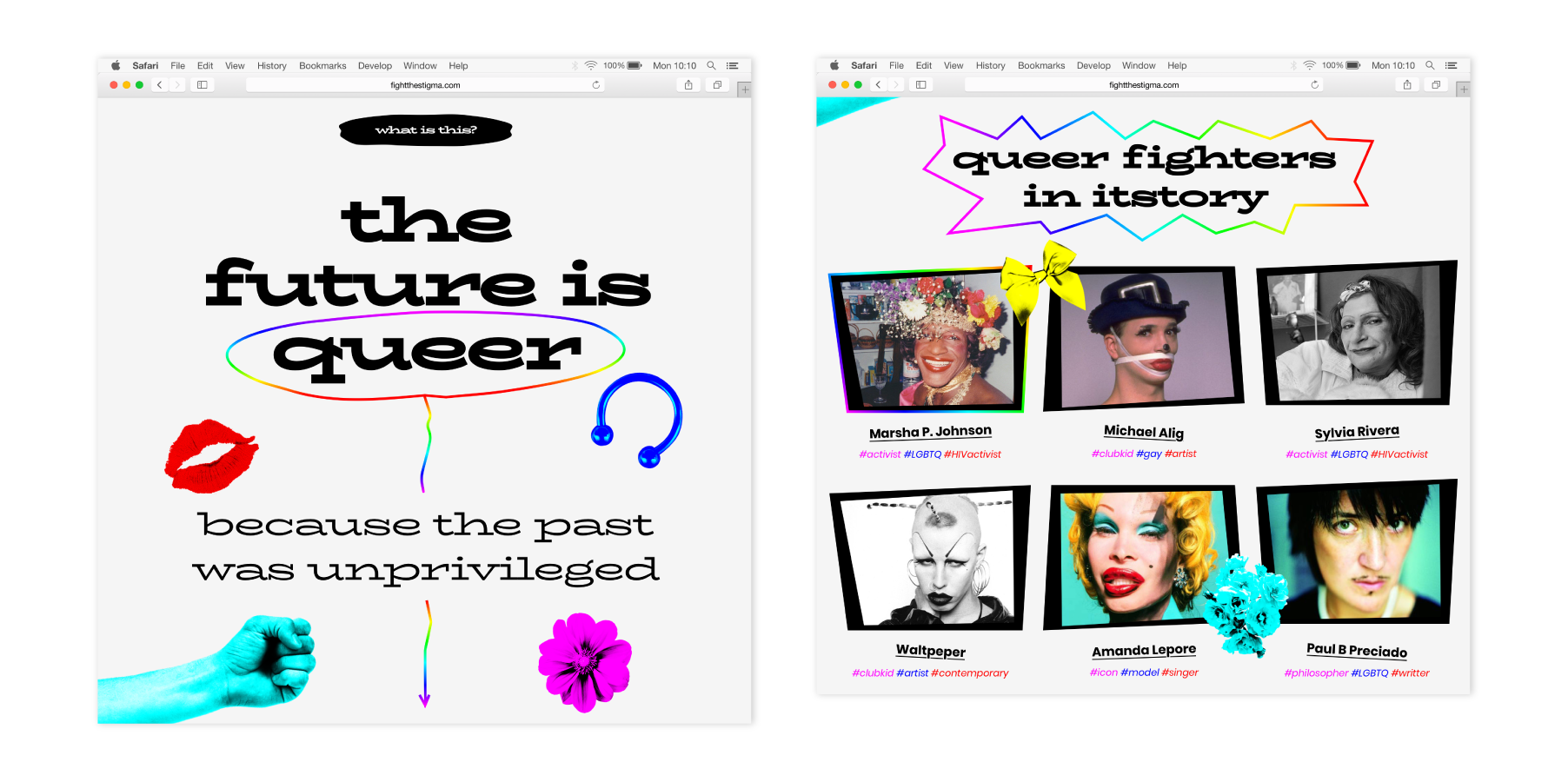
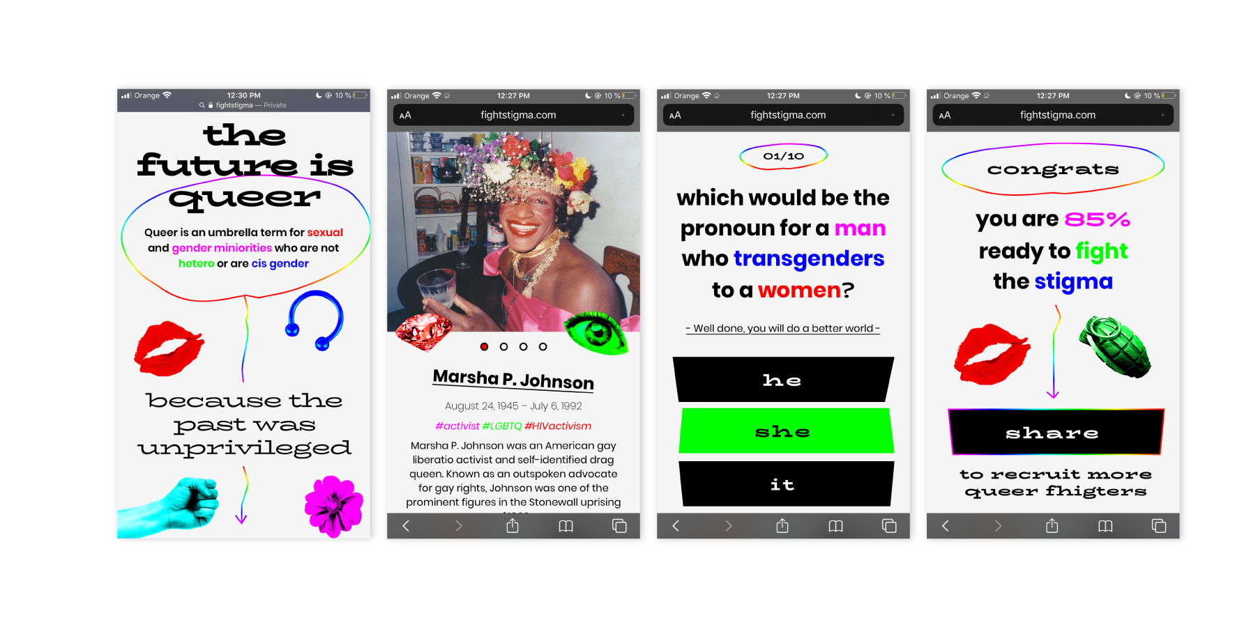
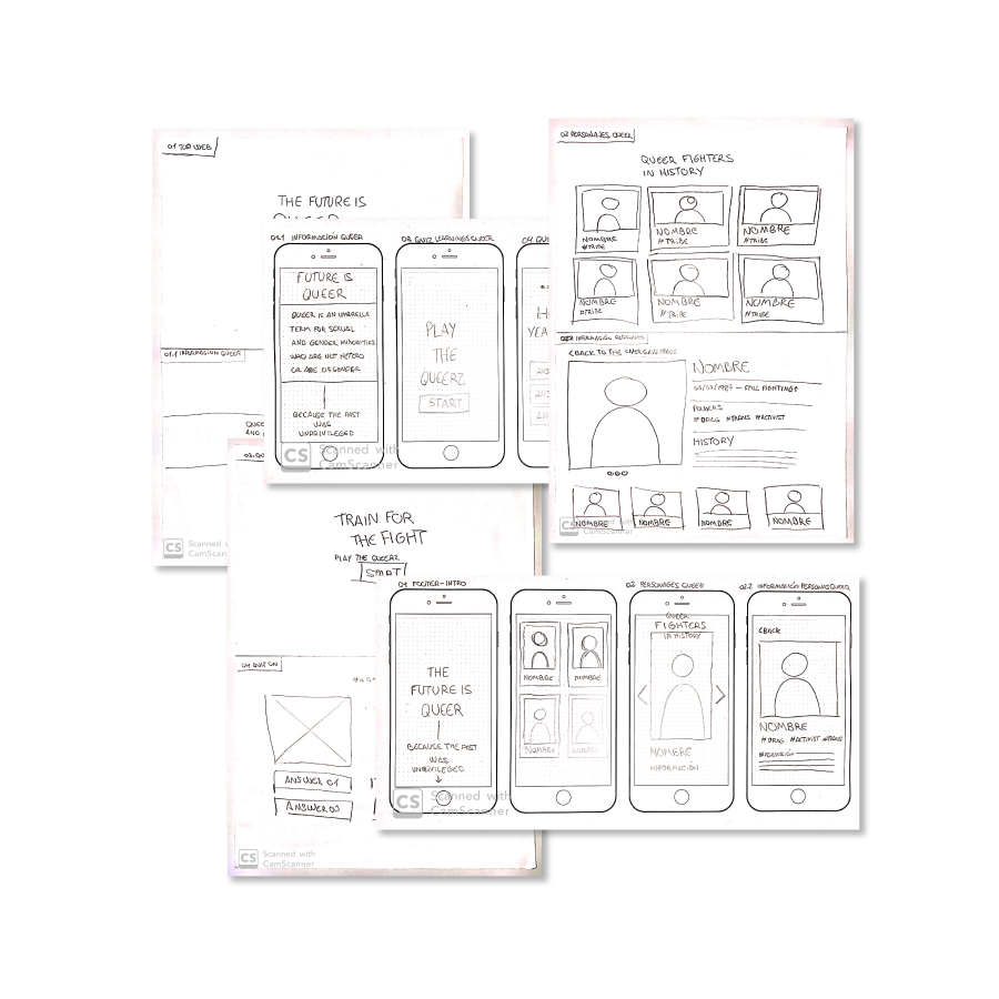
In order to structure the landing page consistently we envisioned 3 sections, all of them provided with a common thread – the fight. On the first one, it is important to let users know the topic, providing them with a clear introduction of the content they are going to find.
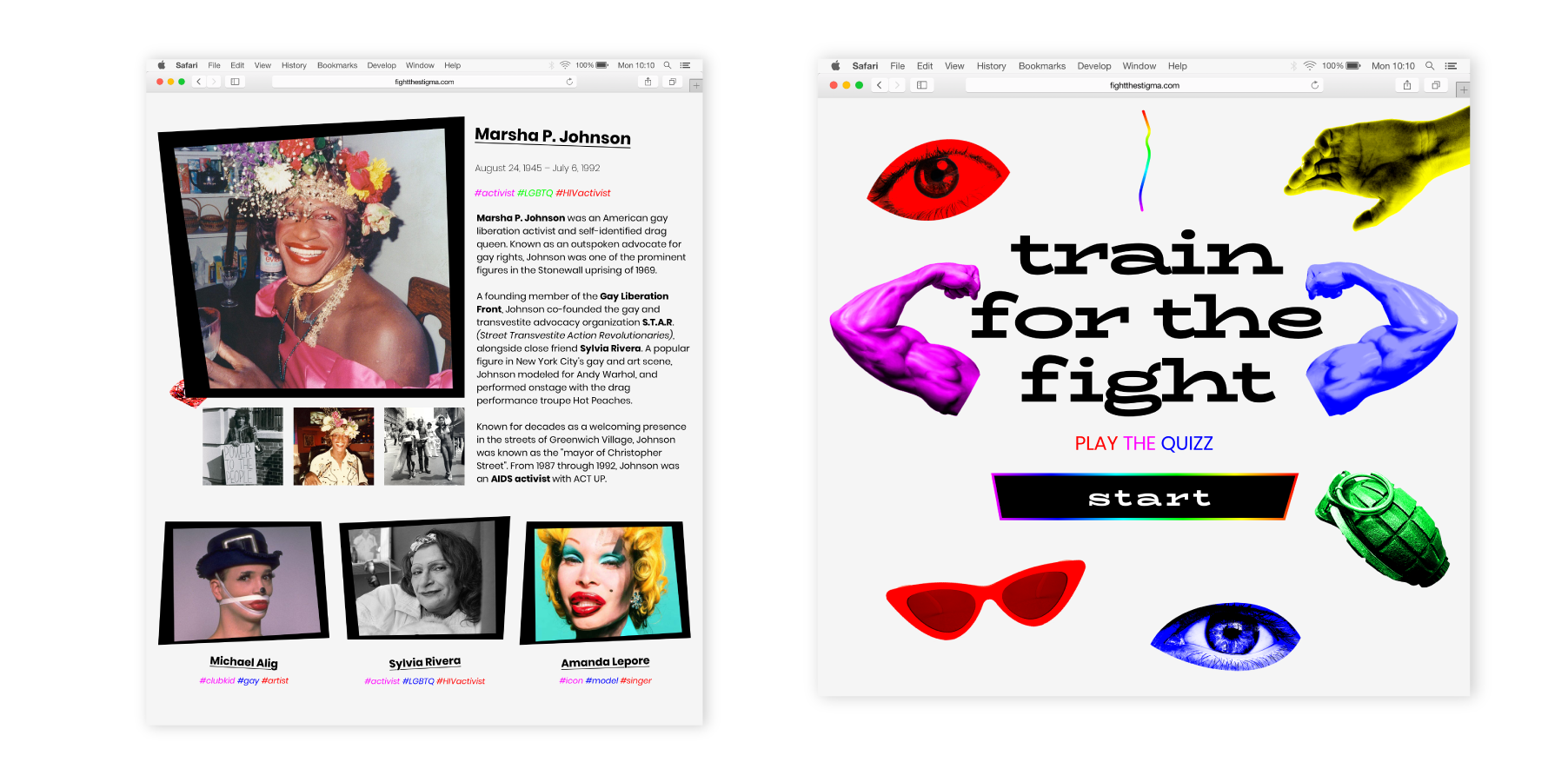
On the second section, they will get to know the fighters: the most relevant figures that took part in the movement. The fighters will have individual pages and the users will be able to find detailed information and pictures of all of them.
Last but not least, the third section will be the most interactive one. Users will be able to “train” themselves to join the fight. They will receive inclusive and open learnings by playing a quiz. They will have the option to share their score with other users, which will create engagement.
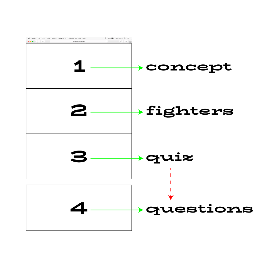
Considering the clear structure of the website, wireframes were crucial to develop the design. They allowed us to see in an orderly fashion how the common thread that was envisioned initially would be structured.
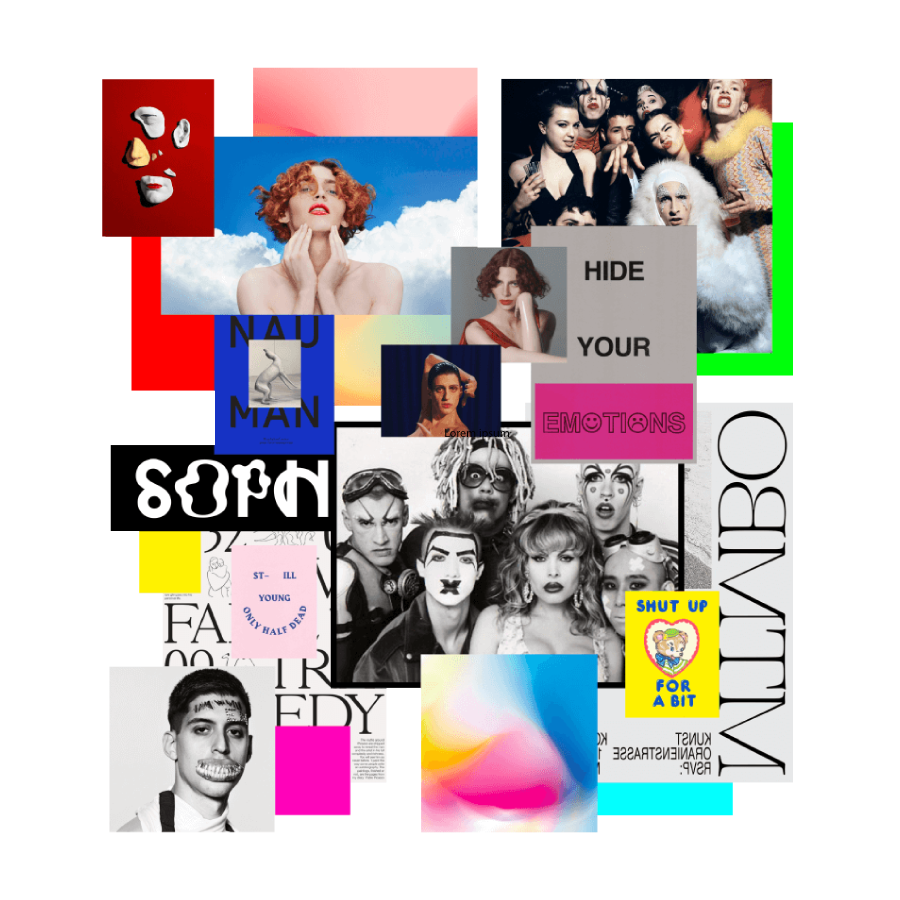
At the time of developing the visuals according to the concept, we looked for certain references that allowed us to have graphic orientation toward our initial idea.
We envisioned an innovative and identifiable look and feel by choosing antiaesthetic visuals.
Once the graphic concept was clear, we defined a more in detail UI of the landing page.
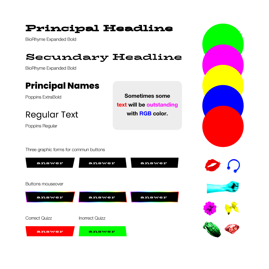
Black and white were key. And RGB colours were therefore in charge of providing context and make a difference. We have chosen these colours considering their singularity and personality, sometimes reviled by mainstream aesthetics.
The fonts used were also crucial. In this case, we used two styles, one for the highlights and another for the texts.
The graphic concept was inspired by collage style, therefore representative elements from the queer community were included in the landing page to create ground-breaking compositions.
